Case Study: AirSembly UX
Challange
After its success as a vendor of cloud-hosted servers, AirVM pivoted to licensing their cloud hosting software to resellers and other cloud service providers. Basically, instead of selling items in a store, we would sell the store itself, and then people can sell whatever cloud services their own particular infrastructure would allow. It would require adding several layers on top of the existing storefront to allow for the management of products, adding distributors and resellers, and creating a unique branded storefront for each instance.
Strategy/Methodology
Our research showed that most cloud-based businesses started with a “service provider” that owned the actual physical hardware, one or more distributors of said infrastructure, one or more resellers of said distribution, and then finally clients who consumed the resold, distributed cloud services. So we would go from one layer of users to up to four layers, depending on the service provider’s business structure. Some had resellers but not distributors, and some just sold directly to clients. We needed a system that could accommodate a wide spectrum of users.
Design Process
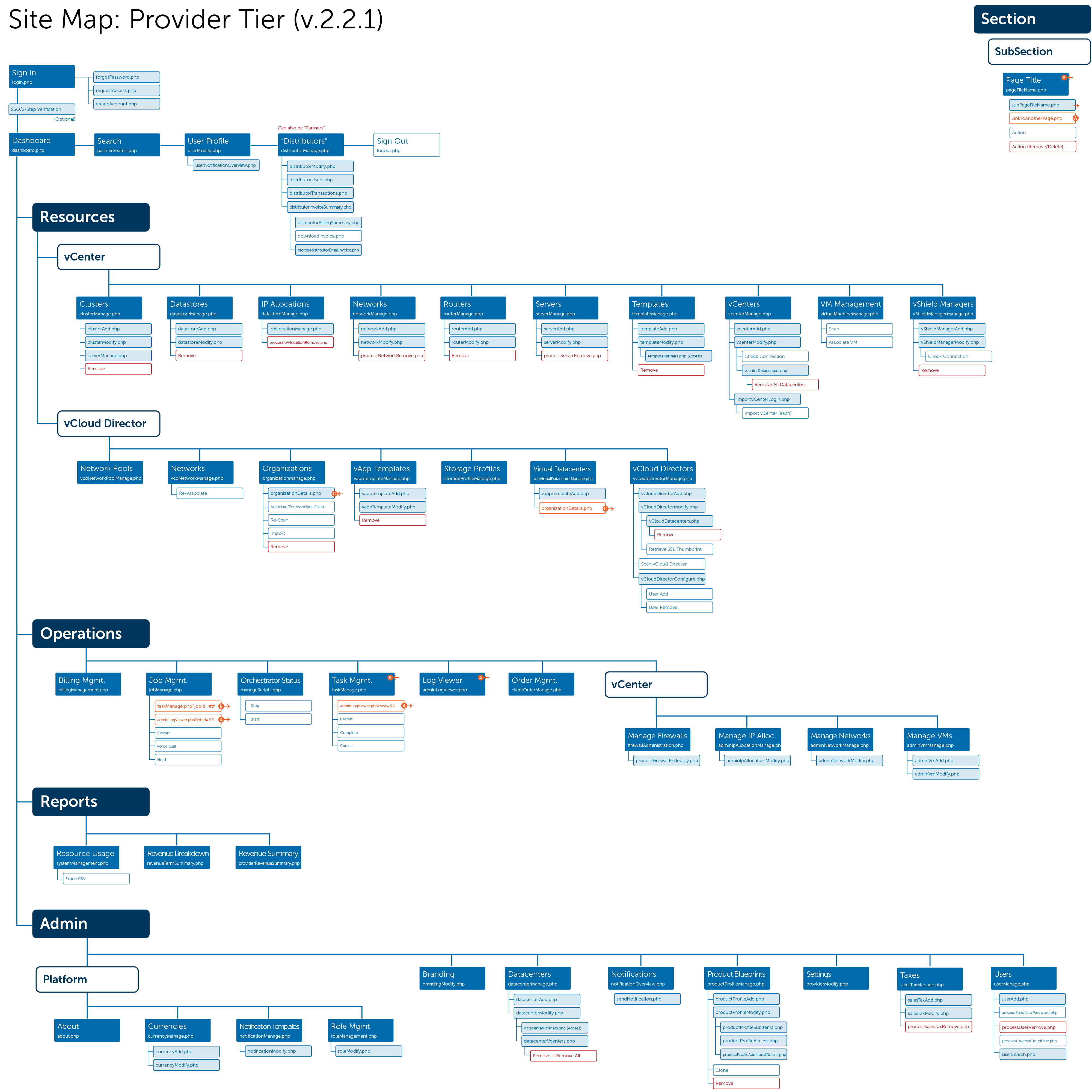
My first step when doing UX is to create a “Functional Spec” document that records all of the actions that a user can do in the system. In this case, extra attention was paid to each “layer” of user to document any functions specific to that type of user. For instance, resellers had certain functions that distributors did not, and clients were the “end user” so they had most of the “consumption” functions. Then, I grouped these functions into logical buckets of tasks. The resulting Information Architecture document showed every function for each level laid out like a traditional site map for a website, except when printed it was over 16 feet long by 3 feet high! This was the blueprint on which everything would be based.
Solution
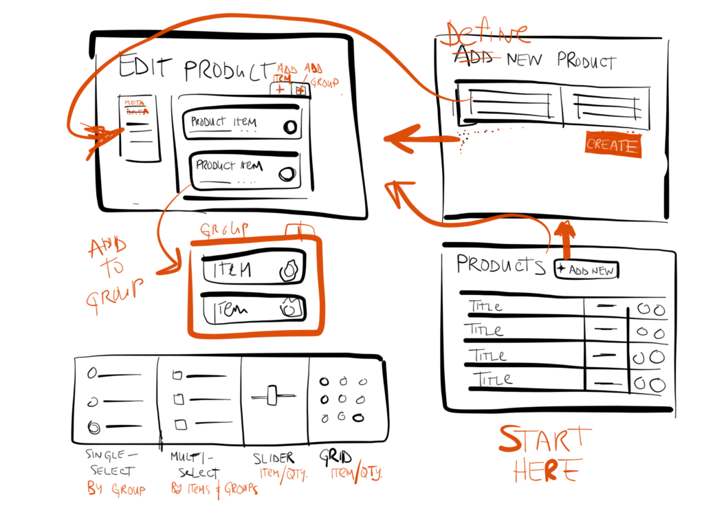
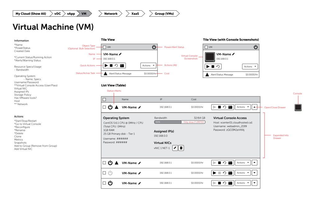
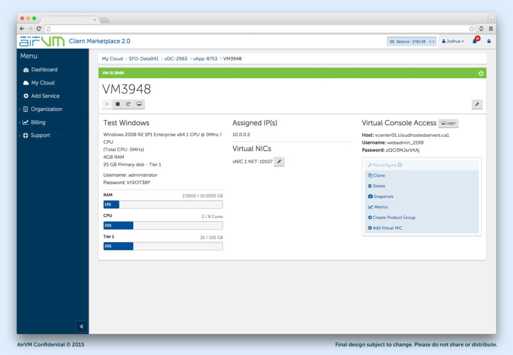
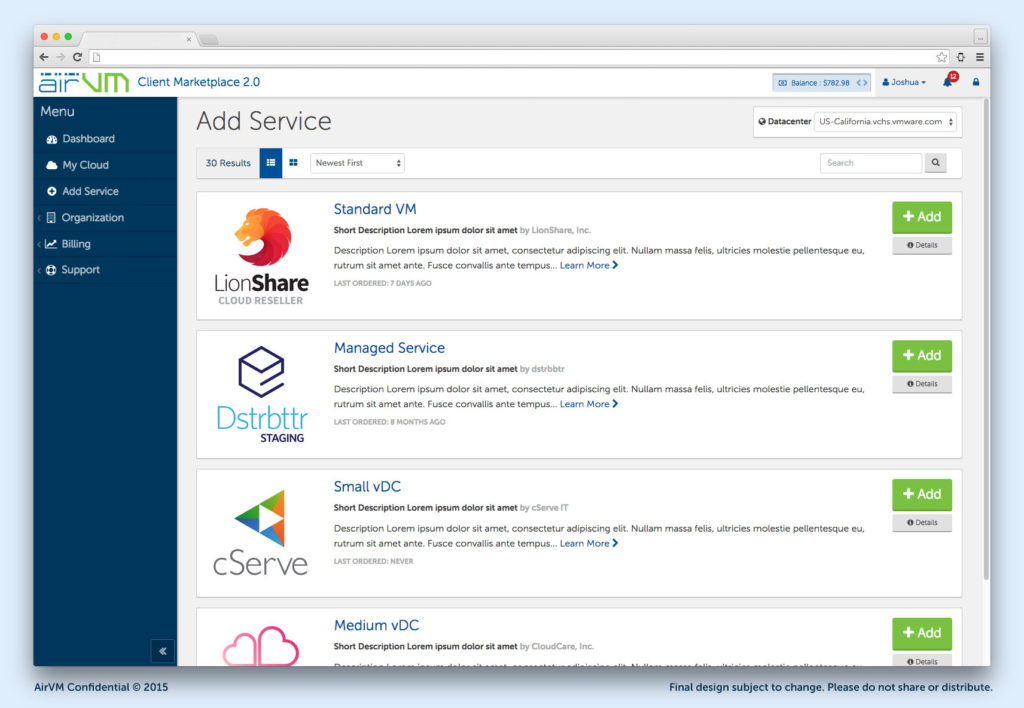
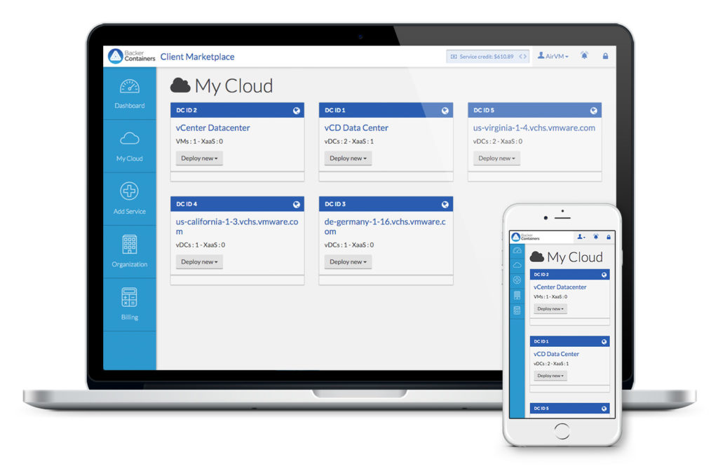
I designed a modular user interface that had elements that could be easily swapped or removed depending on the user’s level of access. The main navigation could have several levels of nested items, all logically organized around the three central pillars of Resources, Operations, and Reports. The interface also had several “shortcut” icons based on frequency of use that would allow experienced users to get to critical paths more easily, such as navigating “down” the system from Provider to Client. The new user experience was more logically organized, easier to change, and completely re-skinnable. You could create multiple storefronts selling the same cloud services, and each one could be completely uniquely branded with logos, colours, fonts, and even custom HTML and CSS. You could wrap your website header around the interface and then customize everything to match, all from one panel of the platform.
Results
The AirSembly Platform was received very well by the community, becoming a finalist at TechCrunch Disrupt in 2014, and winning Best of VMworld 2014 for Public and Hybrid Cloud Computing Technologies. The resulting success and publicity led AirVM to be valued at over $40-million in 2015. The platform had hundreds of service providers at its peak, from small tech shops to multi-million dollar firms. When asked to review the usability and modularity of the site, customers would always give positive responses. They especially loved the navigation menu and the ‘quick links’ as they were called. As new modules were added to the system, it did not break the UX/UI since the whole thing was so modular and adaptable.


