Case Study: AirVM
Background
AirVM.com launched in 2008 as a service to provide a new product to the world. It was called a “virtual machine”, and as we all know it has since revolutionized computing as we know it. Hardware that was one for a single client per server could now be subdivided into multiple virtual servers for multiple clients.
AirVM’s original product was custom cloud hosted servers. At the time the environment and “green technology” was all the rage, so we decided to take the “Air” as both “easy as breathing-” and “clean, open, free”. AirVM was going to use cloud virtualization technology to help make the world a greener place.

Strategy
The original idea was to make an enclosed wordmark with angular letterforms. The main brand aspects I wanted show were ‘easy and useful green technology’. I was admittedly in a space where angles seemed appropriate. I wanted some movement and some contrast between the ‘air’ and ‘VM’ to make it easier to read, since ‘VM’ was a new term I had to make it obviously two words.
I was left with just enough space above the ‘air’ letters to have some element of movement. Since we were moving packets of data, I thought the best element to add would be some tiny squares leading to the ‘VM’. At the time it was my attempt to illustrate the flow of data in as simple manner as possible.


The original ‘moving squares of data’ didn’t read well and it just wasn’t simple enough. I thought of the most basic concept in computing – binary code, but there was no way I was putting tiny 1’s and 0’s in that space. Experimentation led me from squares to circles to finally dots and dashes.
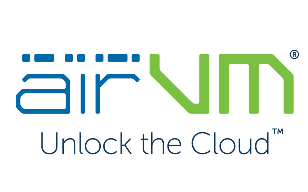
The use of morse code for ‘air’ gives a nod to the original communication technology – telegraph – but still looks modern enough for a cloud company. I always like putting a hidden message in every logo I can. Once paired with the relatively new font family ‘Museo’ – specifically Museo Slab – the brand was finally coming together.
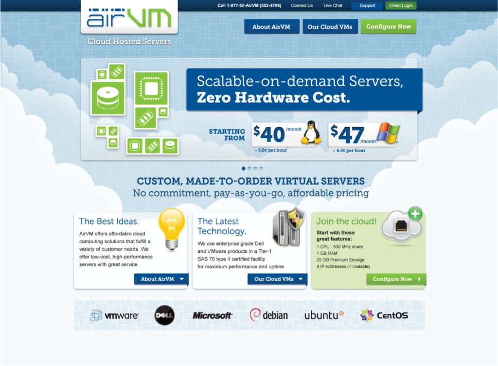
“Version 1.0” (2010–2014)
The “Cloud Hosted Servers” era was all about education and awareness for cloud computing and its potential to change the world. This was at the tail end of the multi-layer Photoshop “overdesign” of the late 2000’s. Rounded corners, intense drop shadows, and subtle patterns were all the rage at the time. My goal was to make it light, fresh, and like you were soaring above the clouds.
The overall aesthetic touched every aspect of the company, from business cards to user interface. The original consumer website and the software UI were both coded by me using HTML/CSS (well, PHP really) with some jQuery. This was just at the start of web fonts, and using Museo on the live site and interface really gave it that next level of polish.


“Version 2.0” (2014–2017)
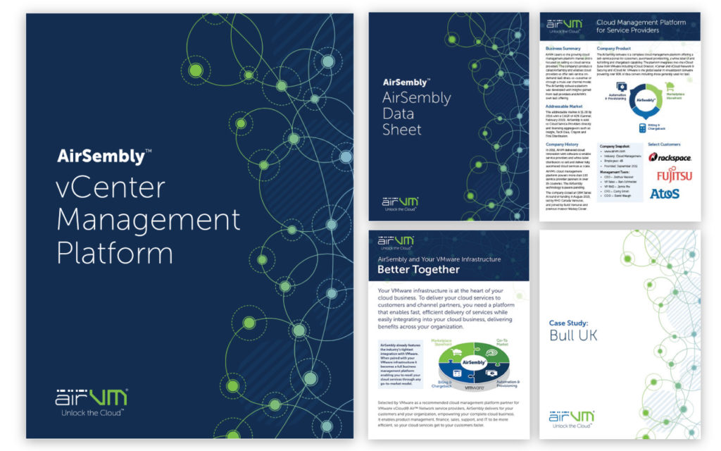
In 2014, the company pivoted to become one of the world’s first VMware cloud management platforms. As the company evolved, the brand was given a refresh leading up to the launch of their second major software product.
To represent the grown up AirVM I made the primary colour a much darker, richer blue, and contrasted it with a more vibrant green. I added a new system of background graphics and ditched the slab serif for a clean light sans.
Brand Evolution
The richer experience of the multi-tier management platform was a great inspiration for the style of the updated brand. The background illustrations were a system of abstract circular nodes linked together. This would tie the brand together across print and digital platforms. Everything was updated for the new look over a period of about three months.


As the demands of the software’s User Experience grew, I made sure to keep it as adaptable as possible. I initiated functionality that enabled a customer to completely transform the UI of the platform using a combination of styling options and custom HTML/CSS. A user could completely restyle their entire portal in a matter of minutes. This enabled customers to have distinct, unique storefronts similar to Shopify.