
Case Study: City Grow
Concept
“How about…Plants emerging from an urban jungle?”

City Grow aims to be the leader in personal cannabis cultivation. The company leases growing space to medical cannabis producers, and soon they will begin to offer space to the recreational market. Their primary target is urban areas, since rural areas obviously have much fewer people and lots of land to grow outdoors. The resulting logo is about as direct a concept as I fashion. There were no other concepts worthy.
I just wanted a tiny city with huge blooms out of the top.
Refinement
Once I’d played around with it for a while, I made a more refined concept. I decided to go with a seedling because of its recognizable shape and universality; every plant starts as a seedling. It’s like the idea that the seedling has the potential to be anything.
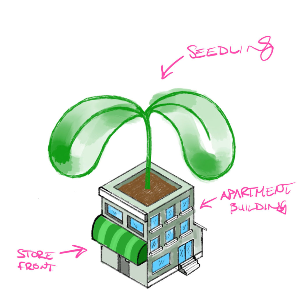
The “urban jungle” became a sort of…weird jumble of building types. An apartment building on one side and a storefront on the other? It came out far too complicated to be a logo. It would need to be much, much simpler.
Execution
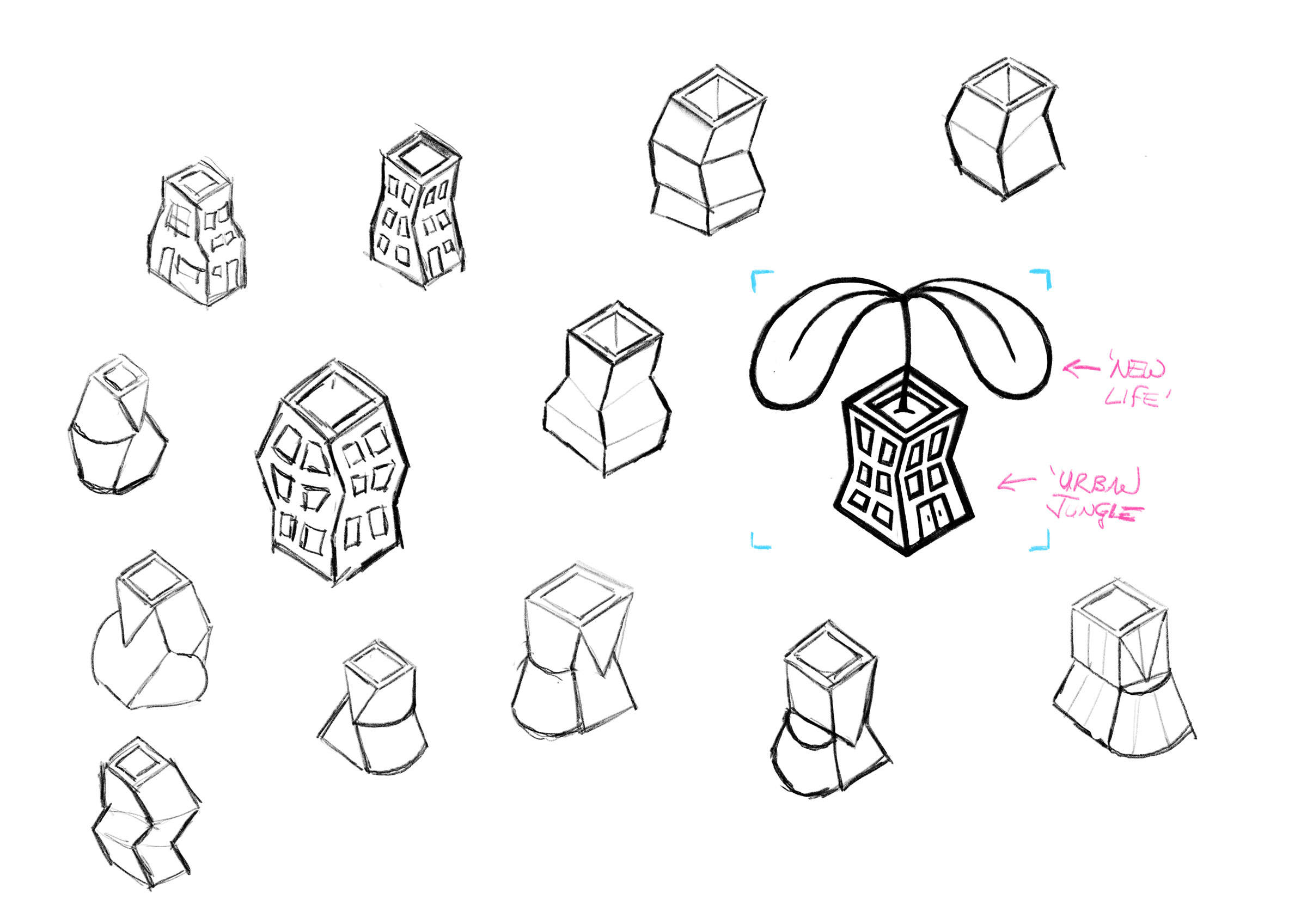
Making the idea into reality can be easy or hard, depending on the complexity of the concept. This was one of the more challenging concepts I’ve come up lately. Here are some of the sketches from that work.
Simple.
I experimented with a bunch of different architectural styles, angles, and ways of making buildings look like buildings. The only way to really say “building” in a logo is doors, windows, or traditional roofs. Since the roof was going to be the “pot”, I tried to make combinations of windows and doors work.
Simpler.
I abandoned the idea of conveying multiple buildings, it was just too complicated a concept to translate into a proper logo mark. I went back to basics and just tried to show a building that was clearly not a house.

Simplest.
I finally settled on the simplest, four-walled shape I could. Then I skewed it and rotated it to give it as much movement as possible. I think I was going for a sort of stretching and twisting motion.

Digitization
The final step in creating a logo is making the digital vector version. Things can change even during this stage, and if you’re careful you’ll see new ways to simplify your concept even further.

Only after I spent the time to make the windows look perfectly aligned did I realize I didn’t even need them at all.

The ‘door’ shape didn’t really need the shadow but I tried it anyway. The spaces between the shapes were increased to work better at smaller sizes.

Further simplifications. The conceived ‘seedling’ shape did not turn out well. It needed some counter forms to make the silhouette more recognizable.
The Final Brand
I paired the eclectic logo with a spunky sans-serif called ‘Rival Sans’. The colour scheme obviously had to include green, so I paired with with a dark grey to give it some class. The brand is clean, fresh, and fun.