Case Study: Senserva
Brand Strategy
I decided early on to dissuade him from using the brand name “Speed of Logic”. I didn’t feel it read well, and didn’t really express what I feel his company was all about. His company was all about embracing this new serverless wave, and I wanted to make a statement around that. I convinced the client to let me pick a word, and I did several brainstorming and experimentation sessions with and without his input. I tried honoring his native country of the Czech Republic, his new country/state of Minnesota, his name, Latin, even Norse syllables.
The Solution
In the end, I decided to go with a slight modification to the Esperanto word for “without server”, which is “senservo”. I thought the creator of Esperanto and Mark both had similar visions for the world, and how their contributions would be seen as universal and unifying. “Senserva” was also conveniently available in every domain extension since it was totally new.


Logo Design
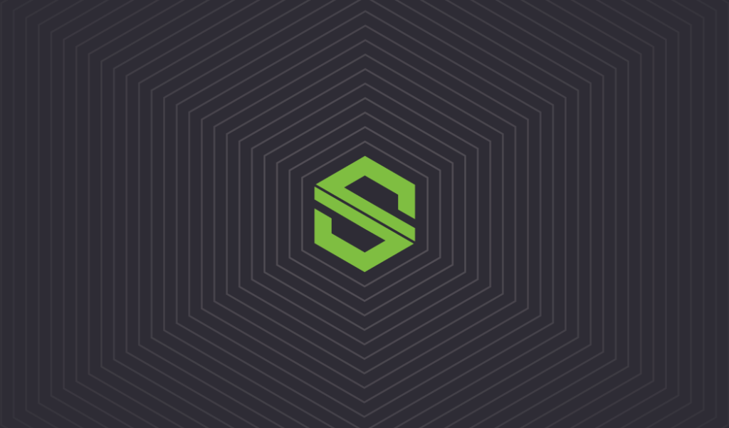
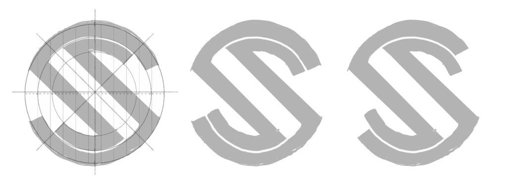
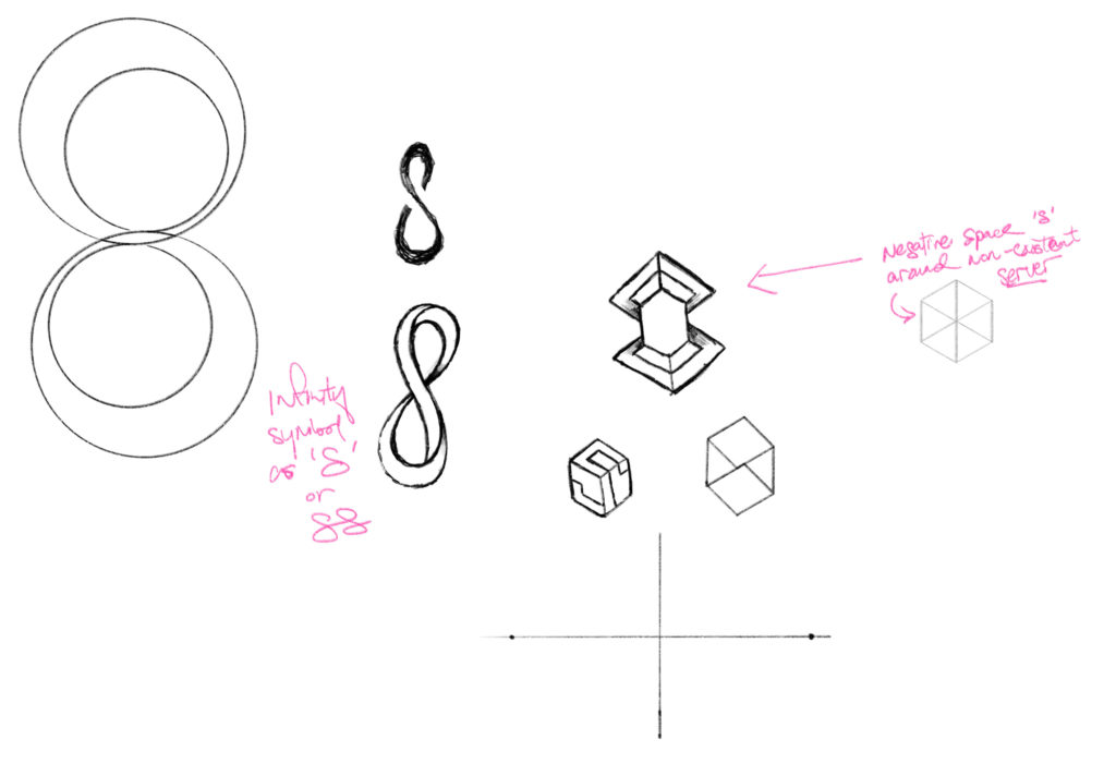
The logo was designed to express the “serverless” aspect of the company, and also be a strong visual mark. I designed an S shape that would sort of ‘fold’ in 3D around an invisible cube – representing the non-server. The client loved the idea, and I refined it to the current shape. A lot of paper was sacrificed in the making of this logo, but I can assure you it really would wrap around a cube! The “line” down the middle was my attempt to make the shape “impossible” and add some interest.


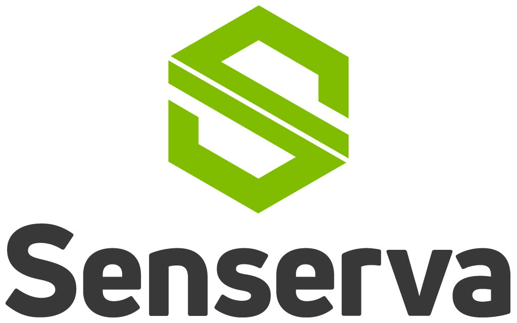
Final approved logo design
Branding Collateral
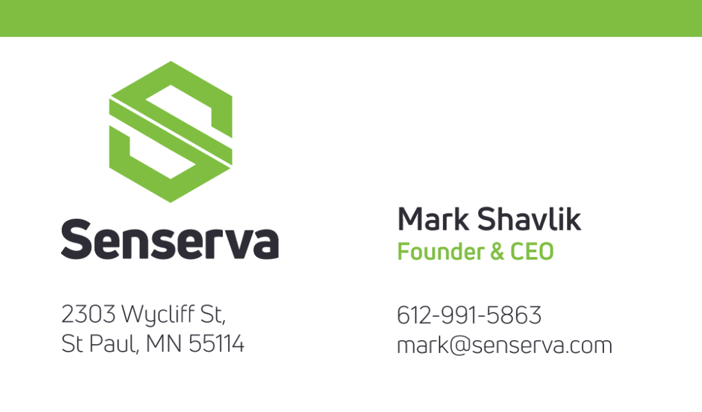
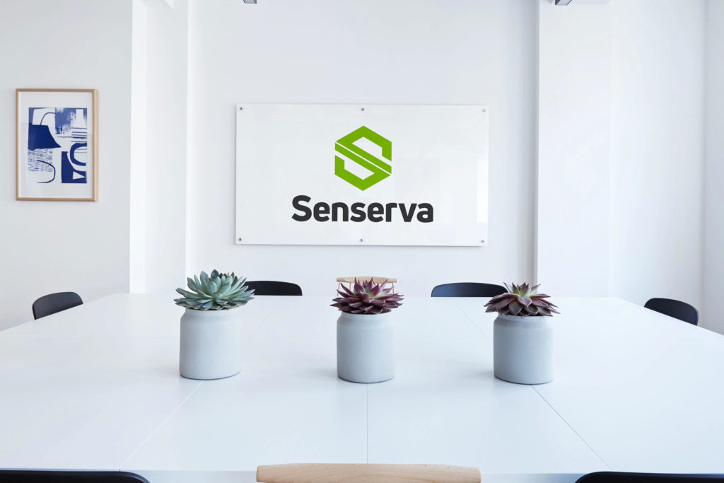
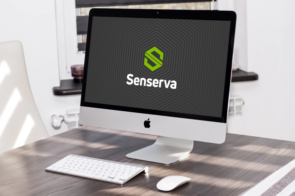
The deliverables included my standard Logo Kit (many file types, sizes, colours, and configurations), a Brand Standards Guide (multi-page PDF), a WordPress Website which included customized illustrations, Business Cards and a Powerpoint Template.