
Case Study: The DINA Project
Project Overview
I worked as User Experience Designer to design an open-source web-based information management system for natural history data, such as collections of biological specimens for museums and labs. The job consisted of meeting with clients and stakeholders and translating their needs into user requirements and wireframes and then coordinate with the development team for implementation. Regular user testing was done with stakeholders and end-users to review implemented designs and iterate based on feedback and other data.
Key Contributions
- Interviewed stakeholders and end-users to create User Requirements
- Created a simpler data model that was more adaptable to their needs
- Designed workflows for data entry and records management for millions of specimens
- Worked with development team to implement UX and UI designs
- Reviewed functionality and iterated designs based on stakeholder feedback
Ways I Delivered
- Met with Stakeholders, End-Users (Collection Managers) multiple times every week.
- Toured Collection Facilities and reviewed existing Collection Management Systems
- Created Wireframe mock-ups to review designs
- Wrote tickets for Development Team to implement approved designs directly in their PM software (Redmine)
- Reviewed developed product with end-users on a weekly basis to iterate and improve designs
The Challange
In short: Too many cooks for one kitchen. The AAFC had been tasked with replacing at least five existing Collection Management systems in use across Canada. As many as 30 million specimens were being catalogued in Excel spreadsheets, Filemaker Databases, and systems designed as far back as the 90’s. Creating one system for several completely different systems was proving to be too much for the developers and managers.
Methodology
I dove right in and met with all of the Collection Managers for every specimen collection in Canada. I documented their needs and observed their current systems for cataloging the specimens for their collection. In each case, there was a wide variety of terminology and processes. However, I was able to find some common threads to weave together a coherent data model.
Solution
In order to make the system work, I did what I call “flattening the data model”. I reduced the number of entities in the system to just one, the Material Sample. This eliminated several levels of complexity right away, since there was only one type of entity to work with. After that it was a matter of working with stakeholders to add the necessary metadata to the central entity.
Results
After 15 months, we had a working Collection Management module that allowed for single and bulk entry, along with some powerful features related to data entry, storage, and determinations. Users would be able to start importing test data in preparation for migration to the new platform. DINA isn’t expected to launch publically until at least 2023.
Work Samples

The most important graphic of the entire project: How to organize the data into manageable entities.

Sketching out the components of the Collection Event data module.
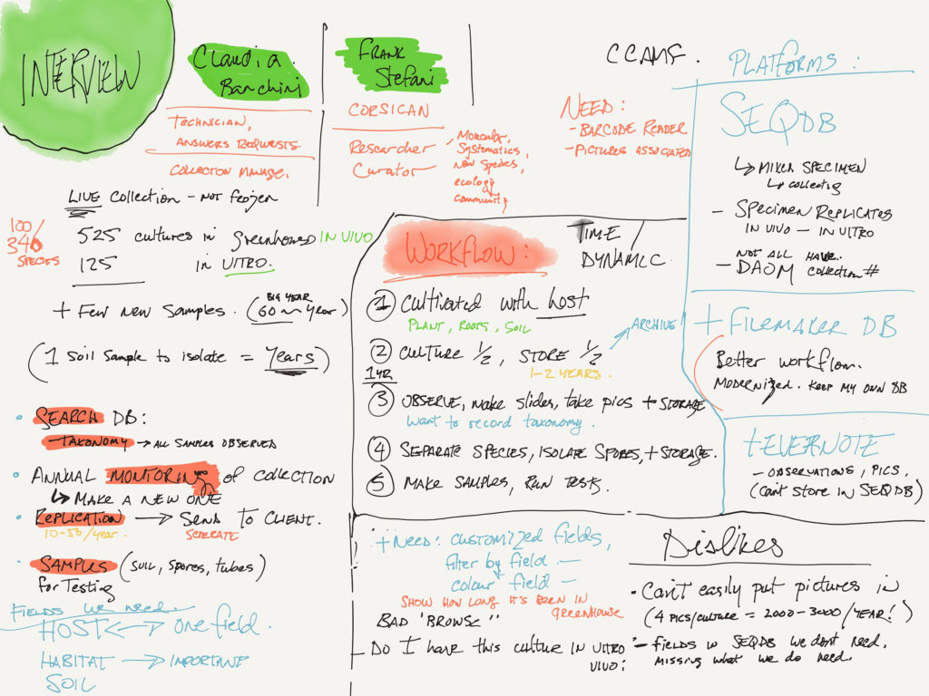
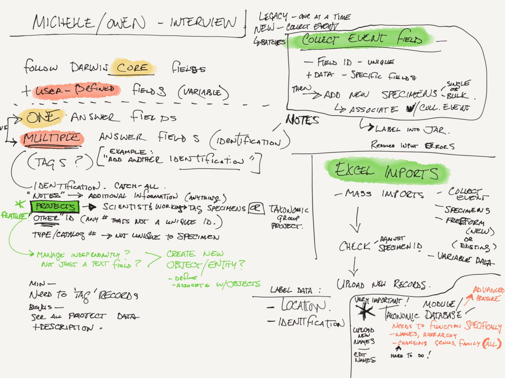
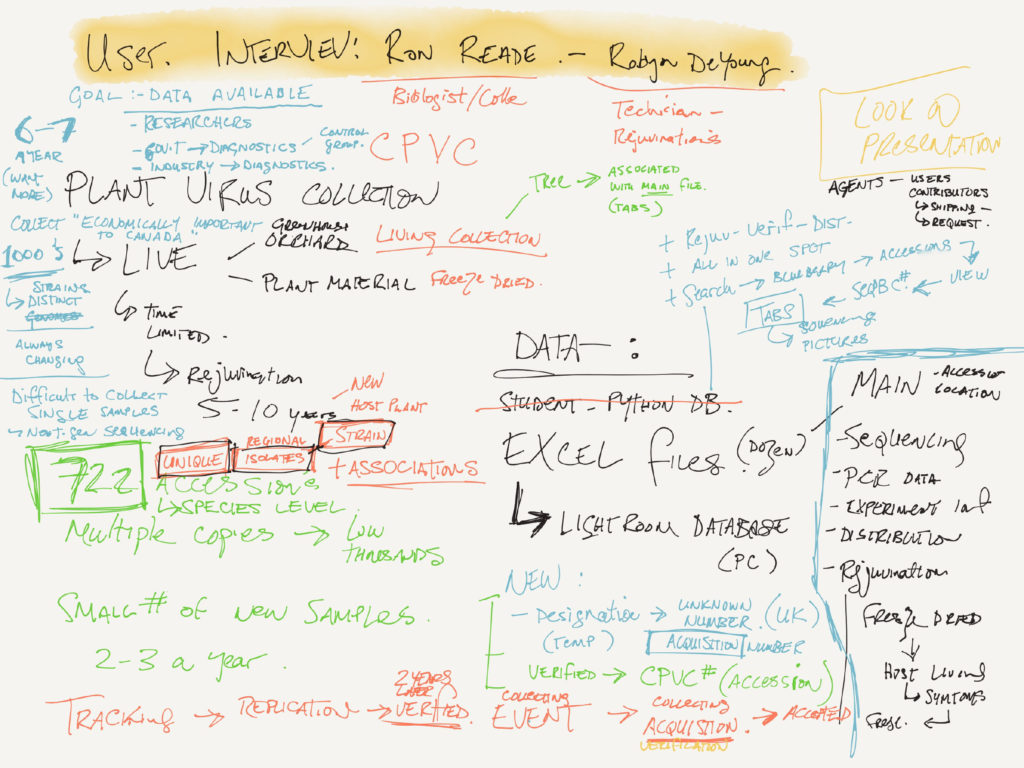
Interview notes from meeting with various Collection Managers. At this point I’m just trying to get an idea of the orders of magnitude of the problem.
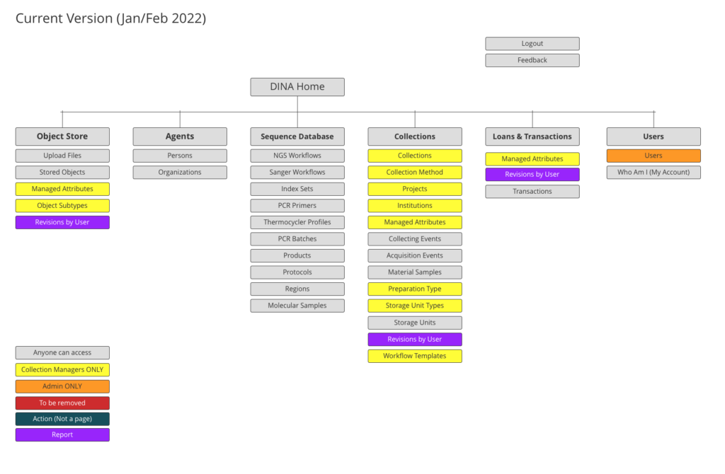

Information Architecture for DINA – Before and After. Trying to create a more logical arrangement of menu items based on use and accessibility requirements. Always try to reduce visible choices when a user cannot use them (i.e. Admin-level selections)
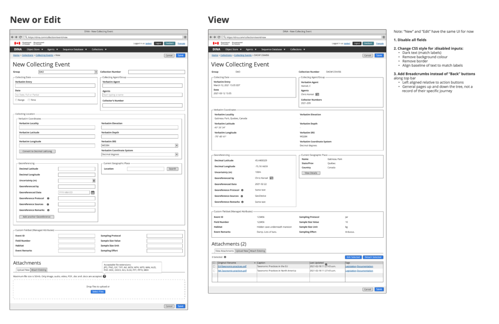
The Collection Event would record how a particular Material Sample was collected. It contained geographic and collector information, as well as some habitat fields.
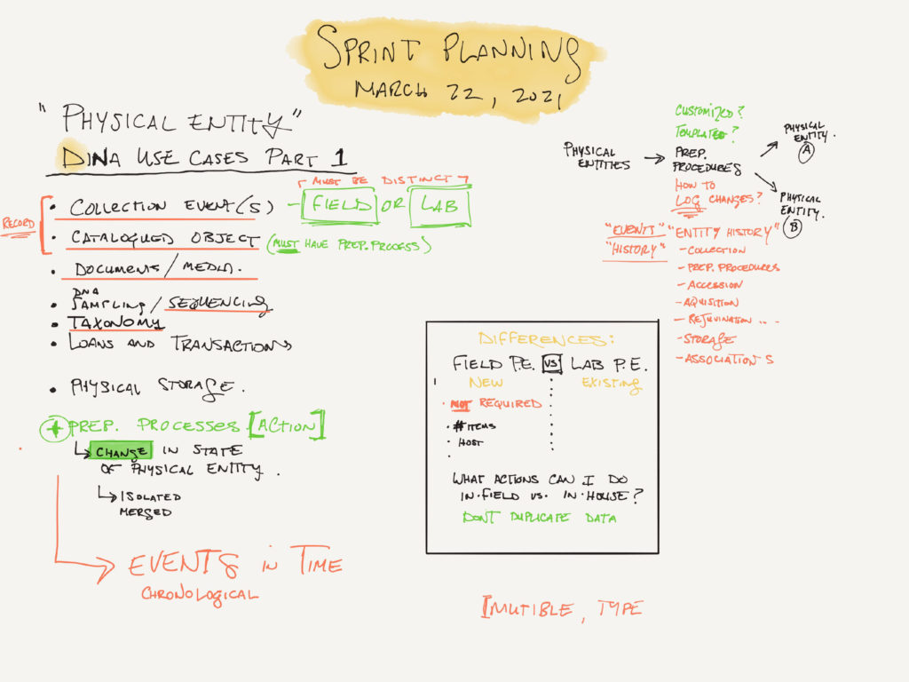


Various hand-written notes taken during consultations with users and stakeholders.
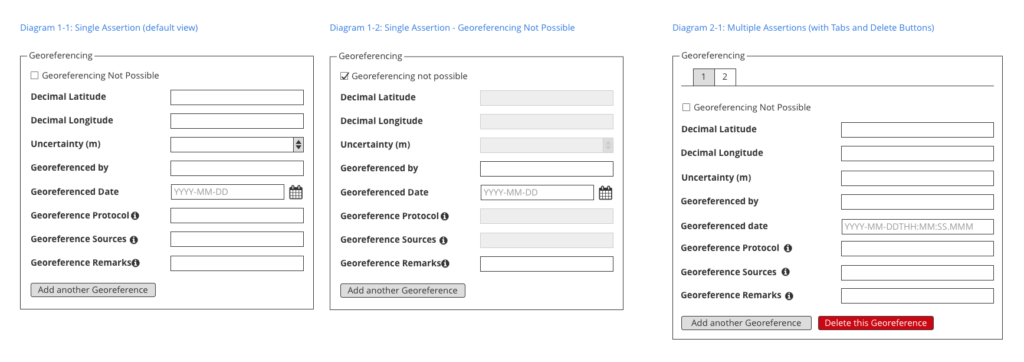
Showing possible variations of the same UI component based on different use-cases.

One of the later UI revisions showing a revised header navigation and menu as well as a re-organized home page with multiple columns for the ‘quick links’.