Case Study: Uniregistry
Background
Uniregistry was a new startup conceived by Frank Schilling, one of the world’s leading domain name professionals. In the early 2000’s, he acquired over half a million domain names under his NAMedia brand. He leveraged the power of Google Adwords to create a domain empire that generated over $20 million a year in revenue simply through parked pages.
Frank’s next company was Domain Name Sales (DNS), which built up a catalogue of over a million domains. After only a few years he was living in the Cayman Islands with a dozen employees and a half billion dollar empire. Always looking to the horizon, Frank saw the opening up of the Global Top Level Domain (gTLD) as a revolution in domain name sales. He would create a new brand for his new venture that would encapsulate his desire to be the world’s premier source for gTLD domains. He decided to call it Uniregistry.

The Brief
Frank is an incredible passionate, powerful personality. He dominates any room he is in with his charisma and bravado. Our initial conversations regarding Uniregistry involved him outlining his 10-year plan and how he wanted the brand to be represented. Of all the clients I ever had, Frank Schilling is by far the most involved and invested I’ve seen.
The scope for the brand was broad and far-reaching. He wanted to create a mature, professional brand of “experts using their expertise to do good”. The culture would be that of “technical brilliance and good governance”, and he confidently asserted that they would bring these new domains to “billions” of people.
Some other promises made by the brand would be “security, stability and even-handed governance.” Uniregistry would be a “beacon of fairness and openness for all current and future Internet citizens.”
Lofty goals, but Frank had the confidence and the personal funds to make it happen. The question was, how was I ever going to make a logo that not only represented how I saw the brand, but also made Frank literally “jump for joy when I see it for the first time.”
The First Logo
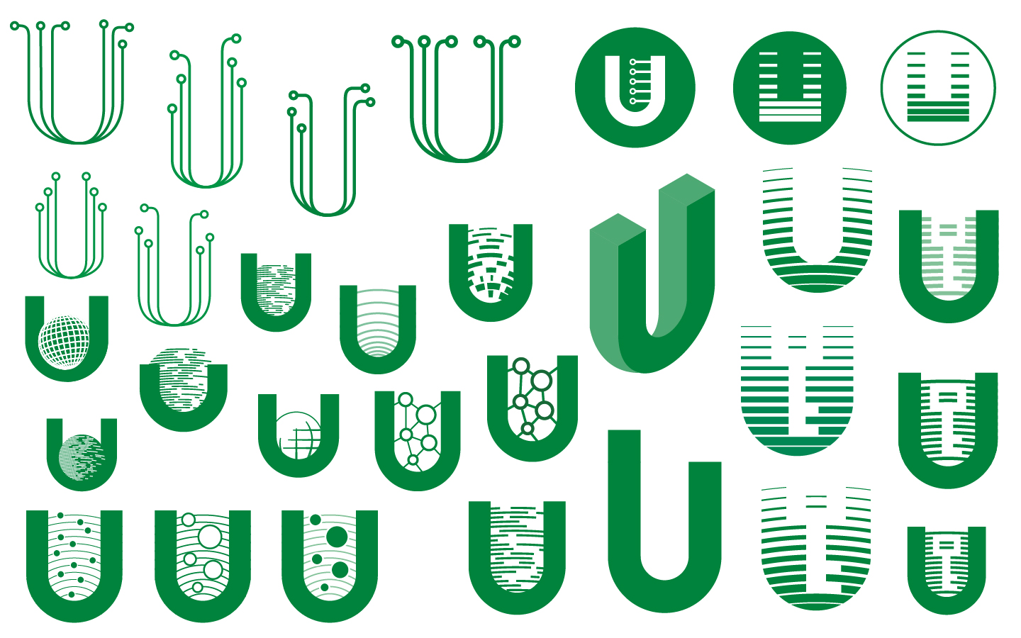
To make matters even more complicated, Frank had already had a logo designed by another designer before approaching me. It incorporated all of the things he wanted: a shield, a key, the letters “UR”, a “D” (for domains!), a heart, and the number 13. This was not only his favourite number, but he pointed out that there were originally 13 Root DNS servers at the beginning of the Internet.
To say that the resulting logo was a complicated, bloated mess would be kind of an understatement. The problem was, he was convinced the logo had to have all of these elements. My greatest design challenge to date would be convincing him that the logo needed to be much, much simpler. I set to work to make a powerful, global brand for a powerful, global man.
Concept: “Technology bringing the world together”
Based on my research of the industry, the business and the client I made some initial decisions :
Shape
The logo would be a letter “U”, but not part of the wordmark. It would convey disparate technical elements coming together to create a cohesive shape, reflecting Frank’s vision for how domains brought the world together.
Colour
Green was under-utilized in the domain space, which was dominated by blues, reds and oranges. To keep it sleek and minimal I would only use greys and blacks as contrast.
Type
The type family would be Proxima Nova. It had the humanist sans serif appeal but at the time was criminally still below the radar. Not quite Helvetica, not quite Futura, it was bold and confident but had a lot of great personality.

Logo 1
The first concept I went with visualized ‘nodes’ of technology, coming together from top to bottom to form the ‘U’. I tried incorporating 13 nodes, but simplicity being the key I found that just five nodes made a lovely little shape.
The first concept was incredibly well received by Frank. He was so pleased with the logo he had me flown down to his office in Grand Cayman to finalize the brand. By the time I arrived, however, he had decided to kill the logo. Someone had pointed out to him that it “kind of looked like sea weed”, and that was all he needed to hear to lose all confidence in the logo.
(Note: On reflection this logo was weak and poorly executed anyway. It made him happy but did not represent the vision for the brand.)

Logo 2
Being influenced by other tech giant logos such as Saul Bass’ AT&T and Paul Rand’s IBM logo, I began to experiment with 13 horizontal stripes as the base for the ‘U’, which vaguely resembled a shield. I used the Golden Ratio and made the lines and space between go from 1 to 13 units of thickness. I added a negative shape of a key to give the ‘U’ the middle counter. Once again, Frank was thrilled with the result and paraded my laptop around the office to everyone.
Honestly, to this day I still think this logo is great. Unfortunately, it just wasn’t to be. When I got home from my trip Frank called to tell me that there was just something he didn’t like about it. He couldn’t explain exactly what wasn’t working, he just insisted that I try again.

Logo 3
At this point, I had to rethink my strategy. I was overthinking it, and I think the think Frank didn’t like was in fact the abundance of ‘cleverness’ I had packed into it. If great Design is what you take away, my next concept was going to be as minimal as I could create.
Returning to my original moodboard, I saw the simple “U” made up of horizontal lines and decided that was the simplest, best chance for success. I kept the 13 lines from the second concept and I stopped there. No keys, no hearts, no shield. Just a clean, simple letterform with some clever math.
It turned out great. Everyone was happy, including Frank. In the end the first thing I had sketched ended up being the winning concept. Sometimes you have to go the long way around to create something that works!

The Final Brand
After being in stealth mode for almost two years, Frank unveiled Uniregistry to the world along with its 54 gTLD applications. The brand was carefully executed across a corporate site, over 50 mini-sites (one per gTLD application), and a new domain management platform that I would serve at the primary UX/UI designer for. After two years I made the decision to remain in Canada, rather than accepting his offer of employment on Grand Cayman.
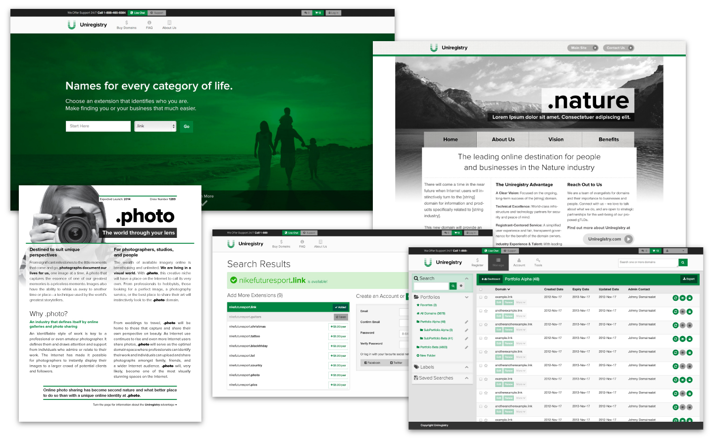
Five years later, the Uniregistry brand is largely untouched. They still use the logo, primary colour scheme and typography as designed by yours truly. It goes to show how a good brief, good research and some tenacity will eventually turn into a great brand!