Case Study: PSAC 70367 Branding
Client Brief
The client was looking to produce a logo for his local union of about 60 nuclear technicians. He specifically wanted something that would look good on printed/embroidered apparel and hats, since this would be mostly where the logo would be seen. The symbol had to contain the phrase “PSAC Local 70367” and have some kind of nuclear/atomic symbol.
Methodology
I wanted something that was specific to this union and not just a generic “nuclear” logo. After some research and interviews with the client, I noted that all of them work with Cobalt 50, and they all use something called a “hot cell manipulator”, which is a really fancy word for “robot arm”. The ‘hand’ part, in particular, was very specific and could be recognized by almost any nuclear technician.
Process
My initial concepts fell quite short of unique, resorting to the cliché “atom” as the focal point. Abandoning those I thought to use the manipulator arm since it was something they all used every day and could connect with. It was the primary tool they used to do their work. The atom symbol became the thing the arm was manipulating, instead of being the entire image. After trying several arrangements of image and text, I ended up going with a balanced arrangement with the manipulator in the centre and text balanced on either side and below. I had played around with both a ‘flat’ style and a slightly three-dimensional one, and in the end decided to go with the flatter style since it would be more legible and easier to reproduce.
Solution
The final concept drawing was brought into Illustrator to be vectorized, and then refined to be able to print at both large and small sizes. It was important to make sure it would look good embroidered, so careful attention was paid to line weights and negative spaces. For very small use (smaller than about 2”), I made a secondary logo that did not have any type in it. This could be for buttons or small badges. The primary colour could be none other than ‘cobalt blue’. As with all of my brand designs, I finished the project by producing a variety of logo sizes, colours and formats as well as a detailed brand standards guide.
Results/Impact
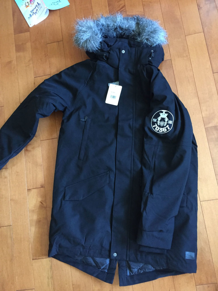
The client’s employer (Nordion) was very impressed with the logo, and has said it’s better than any of their corporate branding. The union members were equally impressed, and truly appreciated that I incorporated a tool they use on a daily basis. So far, the logo has been embroidered onto winter jackets and some water bottles. Based on the success and great reception of the logo, he has been given a $3,000 budget increase to print more apparel this Spring.

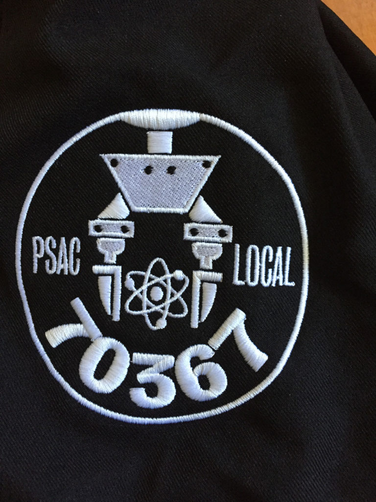
Final Vectorized Logo. Typeface is Bureau Grotesque by Font Bureau.
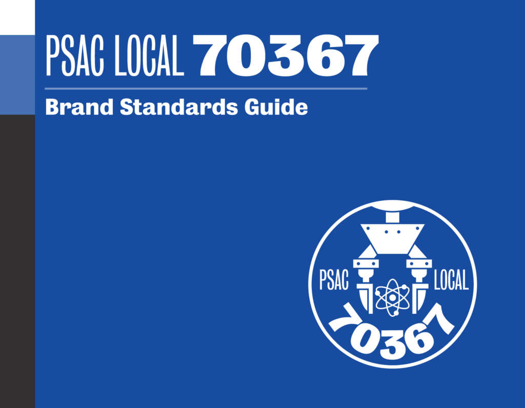
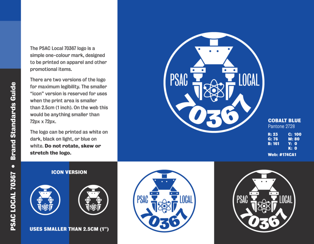

Excerpts from Brand Standards Guide

Sample Hat Application